Introduction
What is the UI Builder?
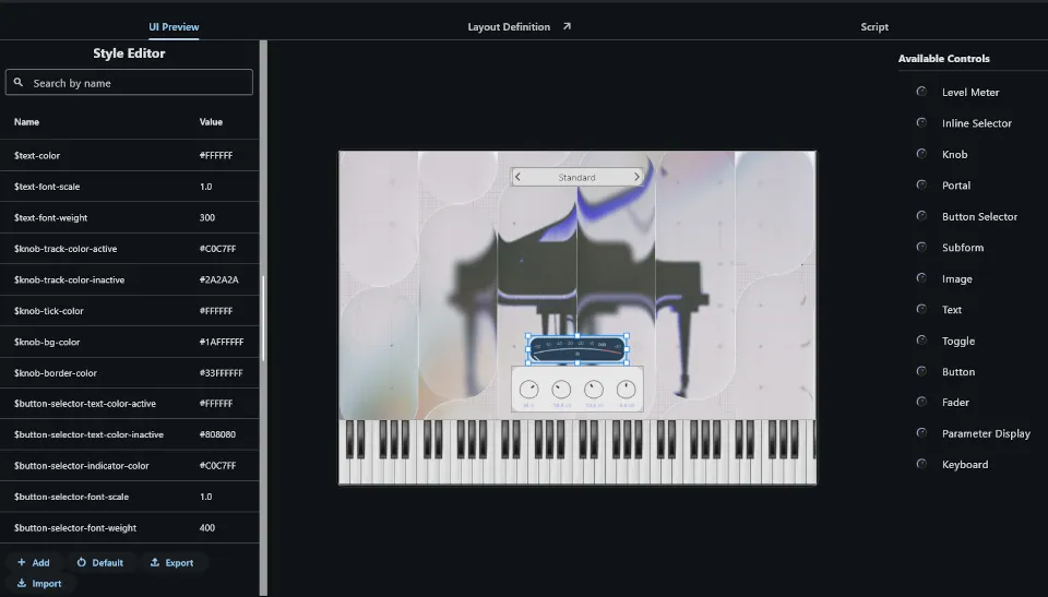
Section titled “What is the UI Builder?”The UI Builder is the part of the authoring platform where you design and wire up the user interface that players of your instrument will interact with. It lives inside the editor alongside the sample mapping, modulation, and scripting tools.
Everything you build here — knobs, sliders, labels, tab panels, custom meters — is described in a declarative format, rendered at runtime by the player engine.
The Two Primitives
Section titled “The Two Primitives”Everything in the UI Builder is built from exactly two things:
- Forms — rectangular containers that hold a list of controls and optional logic
- Controls — typed widgets (knobs, sliders, labels, buttons, …) placed inside forms
That’s it. Complex UIs are built by composing these two primitives recursively — forms can contain controls that themselves host sub-forms.
YAML Files
Section titled “YAML Files”Each form is stored as a .frm file. Under the hood this is a JSON container
with two fields: the YAML form definition (layout, controls, properties) and the
optional Lua backing script. The editor manages both in one place — the UI
Builder panel for the visual definition, the script editor for the Lua code.
Lua Backing Scripts
Section titled “Lua Backing Scripts”Every form can optionally have a Lua script attached to it. The script responds to events (control value changes, form load, etc.) and can read and write parameter values and control properties. For most use cases you won’t need a script at all — parameter bindings handle the common patterns without any code.
Parameters
Section titled “Parameters”Controls are connected to data via parameters. Parameters come from two sources:
- Engine parameters — defined by the audio engine (tuning, filter cutoff, etc.) and copied into the UI from the Layer editor
- User-defined global parameters — parameters you create yourself, useful for UI state like the active tab index or a selected preset slot
A Note on Macros
Section titled “A Note on Macros”Throughout this chapter you’ll see tokens like $text-color or
$knob-tick-color. These are macros — text substitutions resolved by a
global stylesheet before the UI is rendered. They make it easy to keep a
consistent look across your instrument and to pass configuration into reusable
sub-forms. They are covered in detail in
Appearance & Styling.