Appearance & Styling
Controls render with sensible defaults out of the box. This chapter covers how to customize that — from tweaking a single property to building a cohesive look across an entire instrument via the stylesheet.
Stock Rendering
Section titled “Stock Rendering”Every control type has a stock renderer — a built-in visual implementation
driven by properties under props:. Each control type has its own set of color,
sizing, and font props; there are no universal appearance properties shared
across all types. See the Reference for the full props list
per control type.
Defaults and macros: most appearance props are optional. When omitted, the
control falls back to its internal default — which for visual properties is
typically the corresponding stylesheet macro (e.g. omitting color on a text
control defaults to $text-color). This means you get a coherent global look
for free, and changing a macro in the stylesheet updates every control that
relies on its default.
The Global Stylesheet and Macros
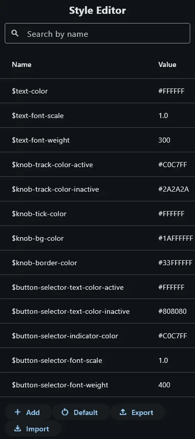
Section titled “The Global Stylesheet and Macros”Rather than setting color: "#808080" on every label individually, the UI
Builder provides a global stylesheet: a flat list of named macros that map
tokens to concrete values.
$text-color = #FFFFFF$text-font-scale = 1.0$knob-track-color-active = #C0C7FF$knob-track-color-inactive = #2A2A2A$button-fg-color = #C0C7FF$button-bg-color = #2A2A2A$fader-track-width = 4$parameter-display-color = #C0C7FFThese are the actual built-in macros with their default values. The complete list is in the Reference. You can also define your own macros — any name that doesn’t clash with a built-in — to drive sizing, spacing, or project-specific colors consistently across forms.
Wherever a macro token appears in any string property value — in props:, at
form level, or in a macroParameters block — it is substituted before
rendering.
Editing the Stylesheet
Section titled “Editing the Stylesheet”Open Stylesheet in the UI Builder toolbar. Add, rename, or change macro values here. Changes reflect immediately in the preview.
Using Macros in Props
Section titled “Using Macros in Props”Any props value can reference macros:
cutoff_label: type: text pos: { x: 0, y: 80, w: 60, h: 16 } props: text: Cutoff color: $text-color fontScale: $text-font-scaleMacros can be composed — a macro value can itself reference other macros, resolved recursively.
Custom Bitmaps
Section titled “Custom Bitmaps”Most controls support replacing the stock renderer entirely with custom artwork,
specified under props::
Static Bitmap
Section titled “Static Bitmap”props: bitmap: path/to/bitmap.pngPhase Bitmap (Filmstrip)
Section titled “Phase Bitmap (Filmstrip)”For animated controls (knobs, sliders, button states), supply a phase bitmap: a single 2-dimensional tile image. The control selects the correct frame based on its current value. Note: when importing traditional 1-dimensional phase bitmaps (“filmstrips”), the image import section in the file tree allows you to auto-convert them to the required 2-dimensional format. The layout engine requires the phase bitmap properties to be encoded into the filename; it’s form is always:
filename_p<num-phases>_c<num-columns>.png
For example, a phase bitmap with 79 phases total and 9 columns would look like this:
example_knob_p79_c9.png
The auto-convert step in the imape import dialog will rename the imported files correctly.
props: displayMode: phaseBitmap bitmap: path/to/example_knob_p79_c9.pngTip: Most professional Kontakt libraries ship 63- or 127-frame strips. 128 frames gives smooth visual resolution without oversized assets.
Macro Parameters in Sub-Forms
Section titled “Macro Parameters in Sub-Forms”Macros are also the mechanism for passing configuration into reusable sub-forms. When you place a Subform control, you supply a macro override block that applies only inside that sub-form instance:
param_knob_instance: type: subForm anchors: { left: 20, top: 40, width: 60, height: 80 } props: form: param_knob macroParameters: $param-id: "08afbf03-738b-48ad-a340-0c482f505683" $label-text: Cutoff $knob-color: "#FF6B35"Inside the param_knob form, $param-id, $label-text, and $knob-color
resolve to the overridden values. This is covered in depth in
Sub-Forms and Composition.