Practical Examples
Four examples, increasing in complexity. Each builds on concepts from previous chapters and introduces at least one new pattern.
Example 1: Simple EQ Panel
Section titled “Example 1: Simple EQ Panel”Demonstrates: static layout, direct parameter bindings, consistent styling via macros.
A three-band EQ panel with a knob and frequency label for each band.
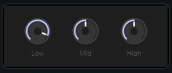
eq_panel.frm
Section titled “eq_panel.frm”width: 320height: 120color: "#1E1E1E"
controls: knob_lo: type: knob pos: { x: 40, y: 24, w: 52, h: 52 } props: parameterUid: "uuid-eq-lo-gain"
knob_mid: type: knob pos: { x: 134, y: 24, w: 52, h: 52 } props: parameterUid: "uuid-eq-mid-gain"
knob_hi: type: knob pos: { x: 228, y: 24, w: 52, h: 52 } props: parameterUid: "uuid-eq-hi-gain"
label_lo: type: text pos: { x: 24, y: 82, w: 84, h: 16 } props: text: Low alignment: bottomCenter color: "#707070"
label_mid: type: text pos: { x: 118, y: 82, w: 84, h: 16 } props: text: Mid alignment: bottomCenter color: "#707070"
label_hi: type: text pos: { x: 212, y: 82, w: 84, h: 16 } props: text: High alignment: bottomCenter color: "#707070"Result
Section titled “Result”Changing any knob drives the corresponding EQ parameter live. To see the
stylesheet in action, you could extract the repeated "#707070" into a
user-defined macro (e.g. $label-color = #707070) and reference it in all three
label color props — one change in the stylesheet then updates all three.
Example 2: Tabbed Interface
Section titled “Example 2: Tabbed Interface”Demonstrates: user-defined global parameter as shared UI state, portal,
buttonSelector synced to tab index — zero Lua.
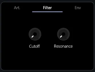
A panel with three tabs (Osc, Filter, Env). Clicking a tab header switches the content area.
Step 1: Global Parameter
Section titled “Step 1: Global Parameter”In Patch Settings, create a global parameter:
| Field | Value |
|---|---|
| Name | tab-index |
| Type | generic int |
Step 2: tab_header.frm
Section titled “Step 2: tab_header.frm”A single buttonSelector control covers all three tab buttons. The active index
is the tab-index parameter value.
width: 320height: 32
controls:  tabs:    type: buttonSelector    pos: { x: 0, y: 0, w: 320, h: 32 }    props:      parameterUid: tab-index      labels: [Osc, Filter, Env]      orientation: horizontal
Step 3: Content forms
Section titled “Step 3: Content forms”Create osc_tab.frm, filter_tab.frm, env_tab.frm — each 320 × 200.
Populate them with controls. The filter tab could reuse eq_panel from Example
1 via a subForm control.
Step 4: main.frm
Section titled “Step 4: main.frm”width: 320height: 232
controls: header: type: subForm anchors: { left: 0, right: 0, top: 0, height: 32 } props: form: tab_header
content: type: portal anchors: { left: 0, right: 0, top: 32, bottom: 0 } props: parameterUid: tab-index forms: - form: osc_tab - form: filter_tab - form: env_tabResult
Section titled “Result”The buttonSelector and portal share tab-index. Selecting a button sets the
parameter; the portal responds by switching to the matching form. No script, no
event wiring.
Example 3: Reusable Channel Strip
Section titled “Example 3: Reusable Channel Strip”Demonstrates: sub-form composition, macro parameter passing, building a reusable component instantiated multiple times with different data.
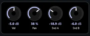
A generic “parameter knob with label and value display” component, instantiated four times for Volume, Pan, Send A, and Send B.
Step 1: param_knob.frm
Section titled “Step 1: param_knob.frm”width: 60height: 80
controls: knob: type: knob anchors: { left: 5, right: 5, top: 2, height: 50 } props: parameterUid: $param-id
value_display: type: parameterDisplay anchors: { left: 0, right: 0, top: 54, height: 12 } props: parameterUid: $param-id
label: type: text anchors: { left: 0, right: 0, bottom: 0, height: 14 } props: text: $label-text alignment: bottomCenterStep 2: channel_strip.frm
Section titled “Step 2: channel_strip.frm”width: 280height: 80
controls: knob_volume: type: subForm pos: { x: 8, y: 0, w: 60, h: 80 } props: form: param_knob macroParameters: $param-id: "uuid-ch1-volume" $label-text: Vol
knob_pan: type: subForm pos: { x: 76, y: 0, w: 60, h: 80 } props: form: param_knob macroParameters: $param-id: "uuid-ch1-pan" $label-text: Pan
knob_send_a: type: subForm pos: { x: 144, y: 0, w: 60, h: 80 } props: form: param_knob macroParameters: $param-id: "uuid-ch1-send-a" $label-text: Snd A
knob_send_b: type: subForm pos: { x: 212, y: 0, w: 60, h: 80 } props: form: param_knob macroParameters: $param-id: "uuid-ch1-send-b" $label-text: Snd BStep 3: Reuse
Section titled “Step 3: Reuse”A second channel strip is just a new .frm file with four different UUIDs in
$param-id. The visual definition lives once in param_knob.frm.
Example 4: Dynamic UI Driven by Lua
Section titled “Example 4: Dynamic UI Driven by Lua”Demonstrates: Lua scripting for logic that bindings can’t express, cross-control side effects, conditional visibility.
An oscillator panel that shows either a wavetable selector or a classic waveform picker depending on which engine mode is active.
osc_panel.frm (YAML)
Section titled “osc_panel.frm (YAML)”Both sub-forms start visible; the script decides which one to show. The toggle is bound to the engine parameter so it reflects any external changes (e.g. preset loads) automatically.
width: 320height: 240
controls:  wavetable_panel:    type: subForm    anchors: { left: 0, right: 0, top: 32, bottom: 0 }    props:      form: wavetable_selector
  classic_panel:    type: subForm    anchors: { left: 0, right: 0, top: 32, bottom: 0 }    props:      form: classic_waveform
  mode_toggle:    type: toggle    pos: { x: 8, y: 4, w: 80, h: 24 }    props:      parameterUid: "uuid-osc-engine-mode"
osc_panel.frm (Lua script)
Section titled “osc_panel.frm (Lua script)”Top-level code runs at form load. Subscribing here means the visibility stays in sync with the parameter for the lifetime of the form — including changes triggered by preset loads or automation.
local function sync_mode(value)  sys_modify_control("wavetable_panel", "", {visible = value})  sys_modify_control("classic_panel",   "", {visible = not value})end
-- sys_subscribe_to_parameter returns the current value, so feeding it-- straight back into the same handler applies the initial state and-- registers for future changes in one linesync_mode(sys_subscribe_to_parameter("uuid-osc-engine-mode", sync_mode))
sys_log("osc_panel loaded")
Why Not a Portal Here?
Section titled “Why Not a Portal Here?”A portal would handle the pure switching case cleanly — bind it to
uuid-osc-engine-mode and list both sub-forms. The script approach is worth
using when you also need side effects on the transition: resetting controls,
logging, updating other parameters. For a simple show/hide, prefer portal.