UI: Static Layout
With sound design finished, this chapter builds the instrument’s UI. Unlike the 303 walkthrough, this one stays mostly static: a background image and a few knobs bound directly to global parameters — no per-instance dynamic control creation, no custom-built keyboard widget. Little scripting is needed here, and what little there is gets introduced as it comes up.
Open the Main Form
Section titled “Open the Main Form”Double-click patches -> main -> ui -> main.form in the file tree to open the
form editor.
Detach the YAML Editor
Section titled “Detach the YAML Editor”This chapter involves editing YAML frequently and seeing the result in real time. Detach the YAML editor to open it in its own window alongside the form preview.

Remember: changes to YAML or Lua scripts only take effect after pressing Apply. Get into the habit of pressing it after every edit — it is easy to forget and wonder why nothing changed.
YAML indentation matters — a lot. This chapter builds
main.form’s YAML incrementally: several steps below ask you to paste a new block into the YAML that’s already there, alongside controls added in an earlier step, rather than replacing the whole file. When that happens, the pasted lines must be indented to match whatever they sit alongside — copying a snippet from this page exactly as printed is not the same as it being correct once it lands in your file at the right depth. Getting this wrong doesn’t always produce an obvious error; it can just as easily produce a control that’s silently ignored. And never mix tabs and spaces — a stray tab looks identical to spaces in most editors but is a different character to the YAML parser, and is one of the most common causes of a form that mysteriously won’t apply correctly. See Core Concepts for the full explanation.
The Background and Onscreen Keyboard
Section titled “The Background and Onscreen Keyboard”Replace the default YAML with the following:
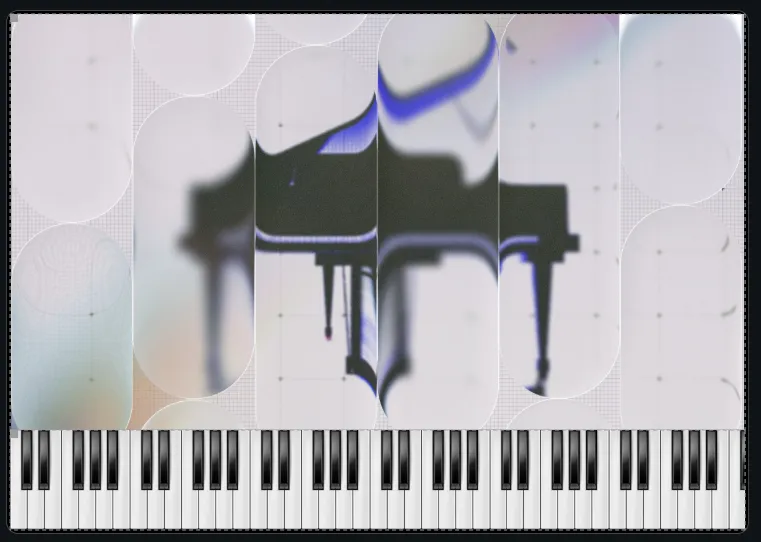
width: 736height: 516controls: bg.image: anchors: { left: 0, top: 0, right: 0, bottom: 100 } type: image props: image: plugin_bg.jpg main.keyboard: anchors: { left: 0, bottom: 0, right: 0, height: 100 } type: keyboard props: startOctave: 1Two controls make up this first pass:
bg.image— the plugin background, imported earlier in Gathering Assets. Its anchors span the full width (left/right: 0) and pin it to the top (top: 0), butbottom: 100holds its bottom edge 100 pixels up from the form’s own bottom edge — reserving a strip along the bottom for the keyboard, rather than letting the background cover the whole form. Declared first, it renders at the back of the stack, with every other control drawn on top of it.main.keyboard— a built-in keyboard control, filling exactly the 100-pixel strip the background leaves free (bottom: 0,height: 100, full width). Unlike the 303 walkthrough, which built its keyboard from individual toggle controls and a Lua script, this is a ready-made widget — one of the reasons this UI needs so little scripting.startOctave: 1sets which octave it starts displaying from.
Press Apply. The background and a playable onscreen keyboard appear together — clicking a key on it plays a note. It doesn’t yet reflect notes played from an external MIDI keyboard; its visual state stays static regardless of incoming MIDI, at least for now.
Create the Meter Form
Section titled “Create the Meter Form”The next element is a level meter: a white panel housing the actual meter, which
is itself driven by a phase bitmap. Right-click patches -> main -> ui in the
file tree and choose Create new UI Form. Name it meter, then double-click
it to open.
Copy the Master Amp’s Processor UID
Section titled “Copy the Master Amp’s Processor UID”A level meter always reads from a specific point in the audio processing chain — a processor. Before writing any YAML, that processor needs to be identified.
Switch to the main.flr layer editor, find the Master amp processor, and
right-click its headline.
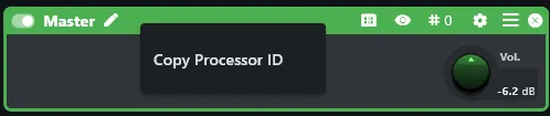
A context menu appears with a Copy UID option. Use it, and note the UID down somewhere for a moment — the next step needs it.
Build the Meter
Section titled “Build the Meter”Switch back to the meter form and paste the following YAML:
# form: "meter"
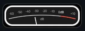
width: 152height: 42controls:  bg.image:    anchors: { left: 0, top: 0, right: 0, bottom: 0 }    type: image    props:      image: meter_bg.svg  main.levelMeter:    anchors: { left: 0, top: 0, right: 0, bottom: 0 }    type: levelMeter    props:      processorUid: "<the uid of the processor to capture from>"      type: peak      phaseBitmap: meter_phases_p200_c8.png
Replace "<the uid of the processor to capture from>" with the UID copied from
the Master amp above. As with every other UID used in this walkthrough, it’s
specific to your own project — the placeholder text itself won’t work.
The two controls: bg.image is the white panel backing the meter, drawn
from meter_bg.svg and filling the whole form. main.levelMeter is the
meter itself, layered on top at the same size. Its processorUid points it at
the Master amp, telling it exactly which signal to visualize; type: peak sets
what it measures; phaseBitmap supplies the filmstrip whose frames animate as
the level changes, the same phase-bitmap mechanism used for the level meter and
step LEDs in the 303 walkthrough.
Press Apply. The meter is now fully functional, reacting live to whatever is being played.
Add the Meter to the Main Form
Section titled “Add the Meter to the Main Form”With meter.form working on its own, it still needs to be placed onto the main
form to actually be visible in the finished instrument. Switch to main.form by
double-clicking it in the file tree, and paste the following at the end of its
YAML, alongside bg.image and main.keyboard — note the two-space indent
below, which matches those two existing entries under controls:. This is the
first of several places in this chapter where indentation must be carried over
by hand; see the warning above if you haven’t read it yet.
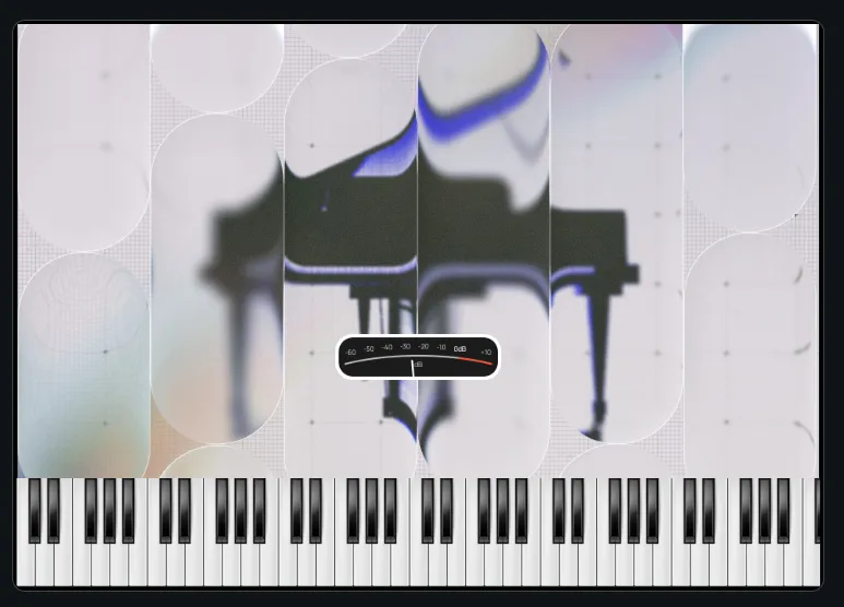
meter.subForm: anchors: { hCenter: 0, bottom: 190, width: 152, height: 42 } type: subForm props: form: meter.formtype: subForm embeds another form’s controls inside this one — here,
meter.form, referenced by its props.form filename. Its anchors position it
independently of the form it’s embedded in: hCenter: 0 centers it
horizontally, bottom: 190 places it 190 pixels up from the main form’s bottom
edge, and width/height match the meter form’s own dimensions, 152×42.
Press Apply. The main form now contains a fully functional meter, reacting live right alongside the keyboard.
Create a Reusable Knob Form
Section titled “Create a Reusable Knob Form”Three controls are still needed — reverb amount, realism, and master volume — and all three share the same appearance: a knob, a caption, and a live value readout underneath. Rather than build that three times, this walkthrough builds it once as its own form and reuses it.
Create a new form the same way as meter earlier. Name it knob, then
double-click it to open. Paste the following YAML:
# form: "knob"
width: 50height: 60controls:  caption.text:    anchors: { left: 0, top: 0, right: 0, height: 10 }    type: text    props:      text: "$text"      fontScale: 0.5      color: "#000"  main.knob:    pos: { x: 11, y: 16, w: 29, h: 29 }    type: knob    props:      displayMode: rotatedBitmap      parameterUid: "$parameterUid"      bitmap: knob.svg      tickAngle: 0  main.parameterDisplay:    anchors: { left: 0, bottom: 0, right: 0, height: 10 }    type: parameterDisplay    props:      parameterUid: "$parameterUid"      fontScale: 0.75      color: "#000"
Three controls, stacked top to bottom: caption.text shows the knob’s
label, taken from the $text macro, in black (color: "#000") at half the
default font size. main.knob is the knob itself — displayMode: rotatedBitmap draws it as a single bitmap (knob.svg) rotated according to
the parameter’s value, rather than the phase-bitmap filmstrip approach used
for the meter and, in the 303 walkthrough, the step LEDs; tickAngle: 0
leaves its rotation range at the control’s default. Both the knob and, below
it, main.parameterDisplay — a built-in control that renders a live text
readout of a parameter’s current value, also colored black to match the
caption — are bound to the same $parameterUid macro, so turning the knob
and reading the number below it always refer to the same parameter.
$text and $parameterUid are macro parameters — placeholders this form
doesn’t fill in itself, left for whichever parent form embeds it to supply. This
is the same mechanism the 303 walkthrough’s step button and keyboard forms use
for exactly the same reason: build the form once, and let wherever it’s used
provide the specifics.
Press Apply. The form renders looking somewhat broken.
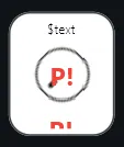
This is expected, not a mistake: $text and $parameterUid have no value yet
because nothing is embedding this form and supplying them. They resolve
correctly once a parent form does — which is exactly what happens next.
Prepare the Master Parameters
Section titled “Prepare the Master Parameters”Before wiring up the three master knobs — reverb amount, realism, and master
volume — two things need doing to each underlying parameter, back in
main.flr:
- Give it a name. Referencing a parameter by raw UID works, but it’s opaque to read and easy to mix up. A name is much more transparent.
- Exclude it from snapshots. Loading a snapshot overwrites every parameter it covers with its stored value. Master volume, reverb, and realism are meant to stay under the player’s control at all times, regardless of which model happens to be loaded — so they need to sit outside the snapshot system entirely.
Both are done from the same context menu, so it’s easiest to take care of them together, one parameter at a time.
Master Volume
Section titled “Master Volume”Switch to the main.flr layer editor and right-click the Vol. knob on
the Master amp.
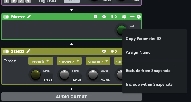
Choose Assign Name. In the dialog that appears, enter master/volume.
The name itself is arbitrary, but it must be unique across the entire patch — a collision between two parameters sharing the same name produces undefined behaviour. This walkthrough follows the same
processor/parameternaming scheme introduced in the 303 walkthrough’s RT scripting chapter (e.g.filter/cutoff) specifically to guarantee that uniqueness.
Right-click the same knob again and choose Exclude from Snapshots.
This is really just a shortcut. Every parameter can be individually enabled or disabled for every snapshot — the snapshot editor has a dedicated column for exactly that.
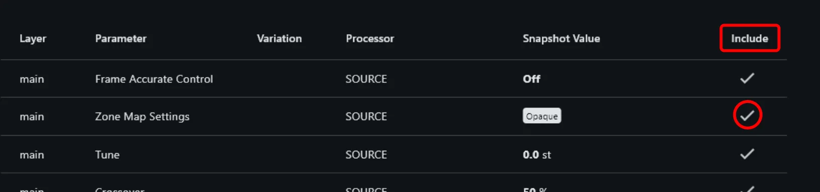
Exclude from Snapshots simply automates ticking that column off across every existing snapshot at once, rather than doing it one snapshot at a time by hand.
Reverb Send Level
Section titled “Reverb Send Level”Repeat both steps — Assign Name, then Exclude from Snapshots — for the
reverb send level knob, naming it reverb/level.
Realism Volume
Section titled “Realism Volume”The Realism amp only exists within the realism zone variation, so it first
needs to be brought back into view: select realism from the zone variation
menu at the top of the layer editor again, the same way as in Pass 2, until
every parameter is flashing.
With variation mode active, repeat both steps once more on the Vol. knob
of the Realism amp, naming it realism/volume.
Create the Main Controls Form
Section titled “Create the Main Controls Form”With all three parameters named and protected from snapshots, the three
knobs can now be assembled. Create a new form the same way as before and call
it main_controls. Paste the following YAML:
# form: "main_controls"
width: 154height: 72controls:  bg.image:    anchors: { left: 0, top: 0, right: 0, bottom: 0 }    type: image    props:      image: knob_bg.svg  realism.subForm:    anchors: { hCenter: -50, vCenter: 0, width: 50, height: 60 }    type: subForm    props:      form: knob.form      macroParameters: { $text: REALISM, $parameterUid: "realism/volume" }  reverb.subForm:    anchors: { hCenter: 0, vCenter: 0, width: 50, height: 60 }    type: subForm    props:      form: knob.form      macroParameters: { $text: REVERB, $parameterUid: "reverb/level" }  master.subForm:    anchors: { hCenter: 50, vCenter: 0, width: 50, height: 60 }    type: subForm    props:      form: knob.form      macroParameters: { $text: MASTER, $parameterUid: "master/volume" }
bg.image is the panel backing all three knobs, drawn from knob_bg.svg and
filling the whole form. The other three controls are all subForm instances
of the same knob.form built earlier, laid out side by side via hCenter
offsets of -50, 0, and 50 around the form’s horizontal center, all
sharing the same vCenter: 0 and the knob form’s own 50×60 size.
Each instance supplies its own macroParameters, filling in the two macros
knob.form left open: $text for the caption, and $parameterUid for the
parameter both the knob and its value readout are bound to. Because those
parameters were given names in the previous step, $parameterUid can simply
be set to the name — "realism/volume", "reverb/level",
"master/volume" — instead of a raw UID. This YAML can be pasted verbatim as
shown, provided the same names were used when naming the parameters earlier.
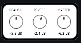
Press Apply. A fully functional main controls section comes to life, all three knobs operational — turning any of them changes its parameter, and its value readout updates live underneath.
Add the Main Controls to the Main Form
Section titled “Add the Main Controls to the Main Form”Switch to main.form and paste the following at the end of its YAML,
alongside the controls already there:
main_controls.subForm: anchors: { hCenter: 0, bottom: 112, width: 154, height: 74 } type: subForm props: form: main_controls.formAnother subForm embedding, the same as the meter earlier: hCenter: 0
centers main_controls.form horizontally, bottom: 112 places it 112 pixels
up from the main form’s bottom edge, and width/height match its own size.
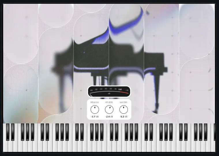
Press Apply and test the result. Between the keyboard, the meter, and now the three main knobs, the piano is almost finished — the only piece left is the model (snapshot) selector, covered next.
Set Up the Snapshot Menu Parameter
Section titled “Set Up the Snapshot Menu Parameter”Switching between the four models from the UI needs a single parameter to bind a control to. Rather than scripting that switch by hand, the engine provides a ready-made mechanism for it: the snapshot menu.
Open the patch settings again — patches -> main -> settings.pst, the same
file used to mark the IR sample as used back in Pass 1 — and switch to the
Snapshot Menu tab. Select all four snapshot files in the file tree
(standard, bright, mellow, honky) and drag them into the list.
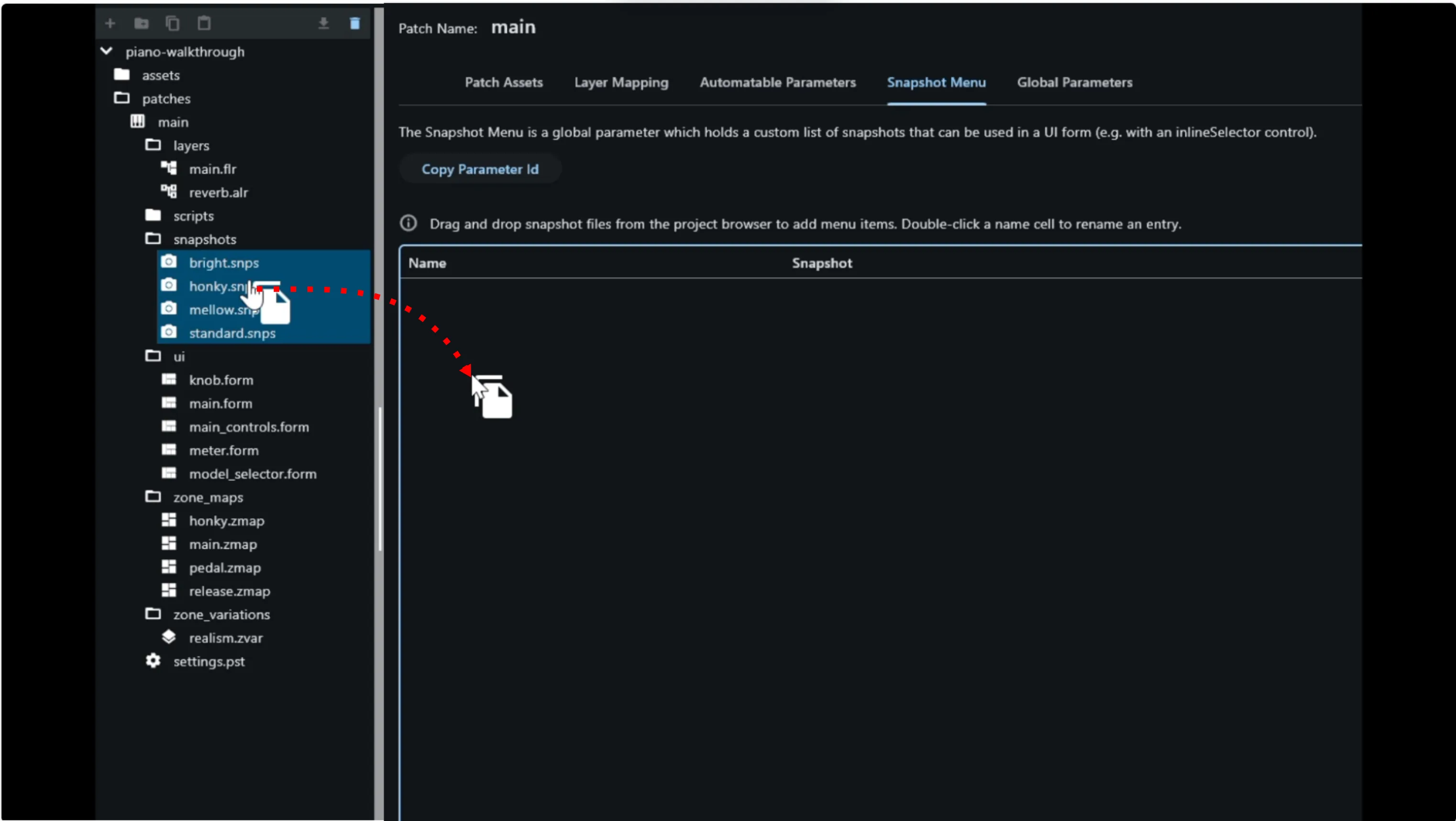
This populates the menu with one entry per snapshot. Since this walkthrough’s UI displays labels in all caps, the entries’ display names are worth editing to match — double-click a name in the list to edit it, and rename each one:
bright→BRIGHThonky→SALOONmellow→MELLOWstandard→GRAND
The display name is purely cosmetic and independent of the underlying
snapshot filename — honky becoming SALOON on screen is simply this
walkthrough’s choice of flavour, nothing more.
Order matters: GRAND needs to come first. The first entry in the Snapshot Menu becomes the selector’s default. Since
GRAND(standard) is the plain baseline model, it should be that first entry — either by dragging the four snapshot files in that order to begin with, or by rearranging the list afterward, dragging individual rows up or down untilGRANDsits at the top. Either approach gets to the same result.This matters again just before publishing: the patch’s current parameter values need to actually match
GRAND/standardat that point too, since those are the values that ship as the instrument’s initial state — covered in Publishing.
Finally, click Copy Parameter Id at the top of the Snapshot Menu list.
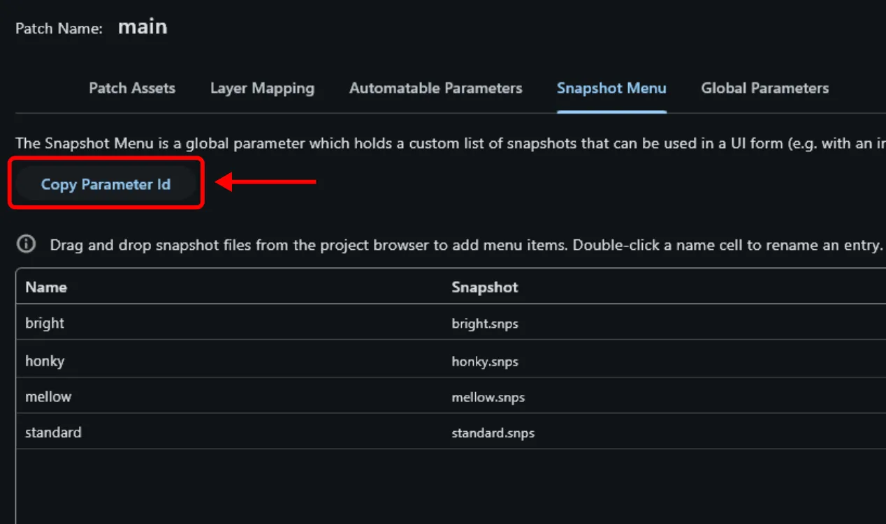
Note the copied UID down for a moment — it identifies the snapshot menu parameter itself, and the model selector control being built next needs it.
Create the Model Selector Form
Section titled “Create the Model Selector Form”Create a new form the same way as before and call it model_selector. Open
it and paste the following YAML:
# form: "model_selector"
width: 206height: 29controls:  bg.image:    anchors: { left: 0, top: 0, right: 0, bottom: 0 }    type: image    props:      image: selector_bg.svg  model.inlineSelector:    anchors: { left: 3, top: 1, right: 3, bottom: 1 }    type: inlineSelector    props:      parameterUid: "<your copied snapshot parameter uid>"      textColor: "#000"      arrowColor: "#000"
bg.image is the selector’s background panel, drawn from selector_bg.svg.
model.inlineSelector is a built-in inlineSelector control — a
click-to-cycle-through-options widget — inset a few pixels from the
background’s edges (left/right: 3, top/bottom: 1). Replace
"<your copied snapshot parameter uid>" with the UID copied from the
Snapshot Menu in the previous step; as with every other UID in this
walkthrough, it’s specific to your own project. textColor and arrowColor
are both set to black, matching the knobs built earlier.
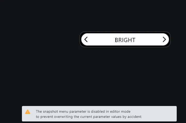
The selector won’t actually switch models inside the editor. Trying it out while still in the editor deliberately does nothing — its operation is disabled there on purpose, to prevent a stray click from silently overwriting the patch’s current state with a snapshot. The editor issues a warning if you try. Full snapshot-menu behaviour is only active once the instrument is loaded as a plugin.
Add the Model Selector to the Main Form
Section titled “Add the Model Selector to the Main Form”Last piece: switch to main.form and paste the following at the end of its
YAML:
model.subForm: anchors: { hCenter: 0, top: 25, width: 206, height: 29 } type: subForm props: form: model_selector.formThe same subForm embedding used for everything else in this chapter:
hCenter: 0 centers model_selector.form horizontally, top: 25 places it
25 pixels down from the main form’s top edge, and width/height match its
own size.
UI Complete
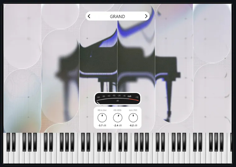
Section titled “UI Complete”Press Apply. The GUI is now complete: background, onscreen keyboard, level meter, the three main knobs, and the model selector, all in one form and all operational (aside from the model selector’s in-editor switching, disabled by design as noted above).
With the UI finished, the last remaining step is publishing the instrument.