Layout
The UI Builder supports two placement modes. You can mix them freely within
a single form. Both are top-level fields on the control — not inside props:.
Absolute Placement (pos)
Section titled “Absolute Placement (pos)”Specify exact pixel coordinates using the pos field:
my_control: type: knob pos: {x: 20, y: 40, w: 120, h: 32}The shorthand keys are w and h (not width/height). All four values
are required when using pos.
Absolute placement is fine for fixed-size forms where you know the dimensions upfront. It breaks down when you want a form that adapts to different sizes or when you’re reusing a sub-form in contexts with different available space.
Anchor-Based Placement (anchors)
Section titled “Anchor-Based Placement (anchors)”Anchor placement pins one or more edges of a control to the form boundary. The engine solves the geometry at render time, so the control adapts to whatever size the form has.
my_control: type: knob anchors: {left: 10, top: 10, width: 50, height: 50}Note: anchors uses the full width/height keys (unlike pos which uses
w/h).
If you’ve done CSS layout, think of it as position: absolute with
left/right/top/bottom offsets — the control is pinned to the edges
you specify and the engine fills in the rest.
Available Anchor Keys
Section titled “Available Anchor Keys”| Key | Meaning |
|---|---|
left | Distance from the left edge of the form |
right | Distance from the right edge of the form |
top | Distance from the top edge of the form |
bottom | Distance from the bottom edge of the form |
hCenter | Offset from the horizontal center of the form |
vCenter | Offset from the vertical center of the form |
width | Explicit width (required if left+right don’t both constrain) |
height | Explicit height (required if top+bottom don’t both constrain) |
- Pin two opposite edges (e.g.
left+right) — width is derived, the control stretches. - Pin one edge +
width— fixed size anchored to one side. - Pin all four edges — control fills the form minus the margins.
- Use
hCenter+widthto center horizontally;vCenter+heightto center vertically. The offset is applied from the center point, sohCenter: 0places the control’s center exactly at the form’s horizontal midpoint.
Common Patterns
Section titled “Common Patterns”Fill the form with margins:
anchors: {left: 8, right: 8, top: 8, bottom: 8}Stick to the right, fixed width:
anchors: {right: 12, top: 20, width: 80, height: 24}Horizontal fill, fixed height, pinned to bottom:
anchors: {left: 0, right: 0, bottom: 0, height: 32}Centered horizontally, fixed width:
anchors: {hCenter: 0, top: 20, width: 80, height: 24}Centered both axes:
anchors: {hCenter: 0, vCenter: 0, width: 80, height: 80}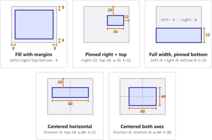
Mixing Both Modes
Section titled “Mixing Both Modes”pos and anchors are set per-control. A form can have some controls
placed absolutely and others via anchors. A common pattern is to use pos
for fixed decorative elements and anchors for functional areas that
adapt to size.
Quick Reference
Section titled “Quick Reference”| Field | Placement | Keys | Notes |
|---|---|---|---|
pos | Absolute | x, y, w, h | All four required |
anchors | Anchor | left, right, top, bottom, hCenter, vCenter, width, height | Supply enough to fully constrain the control |