Your First UI
This walkthrough builds a minimal but complete UI: a single knob wired to an engine parameter, with a label beneath it. No Lua, no sub-forms — just the essentials.
1. Create a New Form
Section titled “1. Create a New Form”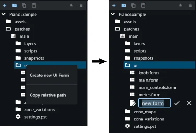
In the editor, right-click on the “ui” folder in the patch and click Create
New UI Form. Give it a name (e.g. main) and click the Ok button. The form
appears as a blank canvas with one dummy element pre-created.
The Editor at a Glance
Section titled “The Editor at a Glance”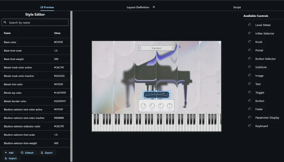
The UI editor has three tabs. You’ll spend most of your time in the first two:
- UI Preview — a live visual representation of the form. Controls can be moved and resized interactively. You can pan the canvas by click-dragging and zoom with the mouse wheel.
- YAML Editor — the raw form definition. This tab can be detached into its own floating window so you can see the preview and the code side by side while you edit.
- Script Editor — the Lua script for the current form. Only needed once you reach the scripting chapters.
The UI Preview toolbar
Section titled “The UI Preview toolbar”When the UI Preview tab is active, a toolbar appears at the top.
Style editor (leftmost icon button) — opens the global stylesheet editor, where you can tweak, import, or export the instrument’s visual theme.
Geometry Edit menu — choose Off, Position, or Warp. With
Position active you can drag controls to reposition and resize them
interactively. With Warp active you can drag individual corners to introduce a
perspective distortion. Note that only controls using pos layout can be
repositioned; anchor-based controls must be adjusted in YAML. Any control can be
warped regardless of its layout method.
Tools menu — a collection of auto-layout operations such as align, center in
form, and distribute evenly. As with Geometry Edit, repositioning only applies
to pos controls.
Right-side buttons — three toggles worth knowing well:
- Show control borders — draws a dashed outline around every control. More importantly, each outline carries a small square handle at its top-left corner. If the YAML editor is detached and you click that handle, the editor immediately jumps to and selects the corresponding YAML block. This is the fastest way to locate a specific control’s code when working on a complex form.
- Bright / dark background — switches the canvas background between light and dark. A form’s background is transparent by default, so its final appearance depends entirely on where it is rendered. Use this toggle to check legibility in both environments before committing to colors.
- Show plugin toolbar — overlays the auto-generated plugin toolbar that appears at the top of the final plugin window (memory usage, options, etc.). When designing the main plugin form, keep this visible so you account for the space it occupies.
2. Add a Knob
Section titled “2. Add a Knob”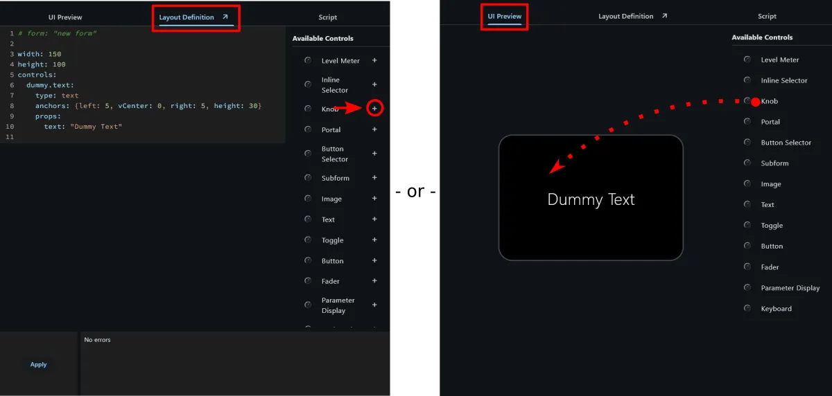
In the control list on the right, either click on the + button (in the Layout Definition aka YAML editor) or drag + drop a knob control to the canvas (in the UI Preview editor). In the YAML editor, the control looks like this:
controls: cutoff_knob: type: knob pos: { x: 176, y: 100, w: 48, h: 48 } props: parameterUid: "" # we'll fill this in the next stepThe key cutoff_knob is the control’s ID — you choose it. It must be unique
within the form and is how you reference the control from Lua scripts.
3. Wire It to a Parameter
Section titled “3. Wire It to a Parameter”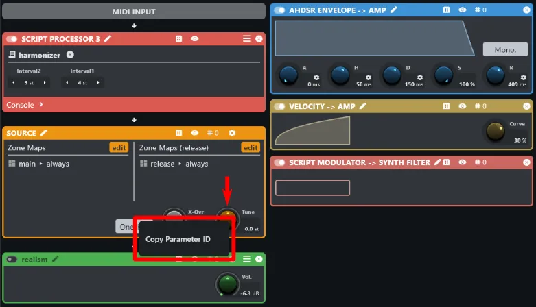
In the Layer editor, right-click the parameter you want to drive (e.g. filter
cutoff) and choose Copy Parameter ID. Paste the UID into the parameterUid
prop:
cutoff_knob: type: knob pos: { x: 176, y: 100, w: 48, h: 48 } props: parameterUid: "08afbf03-738b-48ad-a340-0c482f505683"The knob immediately reflects the parameter’s current value in the preview. Engine parameters like this one have no user-visible name, so they are always referenced by UID — which also guarantees the parameter is unambiguously identified even if there are multiple instances of the same source (e.g. multiple identical filter processors). User-defined global parameters, covered later, can also be referenced by name.
4. Add a Label
Section titled “4. Add a Label”Add a text control beneath the knob. Note that text and align are
type-specific and live under props::
cutoff_label: type: text pos: { x: 156, y: 156, w: 88, h: 20 } props: text: Cutoff alignment: bottomCenter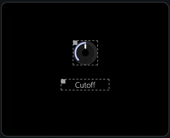
5. Preview
Section titled “5. Preview”Everything you build in the UI editor is actually the real thing, so all controls are working out of the box. Moving the knob should drive the parameter and you should be able to hear the result immediately.
What You’ve Seen
Section titled “What You’ve Seen”| Concept | Where it appeared |
|---|---|
| Form with explicit size | Step 1 |
| Absolute placement | Steps 2 and 4 |
| Parameter binding | Step 3 |
| Label control | Step 4 |
The next chapter covers layout in depth — including anchor-based placement, which removes the need to hardcode pixel positions.